Rebranding reddiedev
Finishing up my brand identity and assets
Finding my brand identity
Figuring out what kind of personality and image I wanted to portray as a developer and freelancer was difficult at first. It was not just simply choosing what colors represent my brand or what fonts to use but mostly about the general vibe and scenery I want my products and services to convey. After much reflection, I was able to figure that out.
Thinking of a name
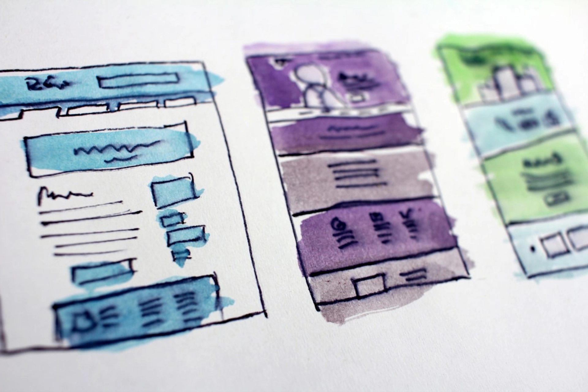
I wanted a short and simple name that was easy to remember and is unique. Looking at other developers they usually just choose their name but I was hesitant on this because I didn’t want to publish my name outright but decided for a nickname instead. Picking a domain was also one aspect of choosing my brand name since I wanted the domain of my then-planned website to fit the name well. After much deliberation, I finally settled on reddiedev since it sounded catchy to me while being compatible with the top-level domain .dev. At this point, I just searched for a random graphic from google as a temporary logo as I was brainstorming for that.
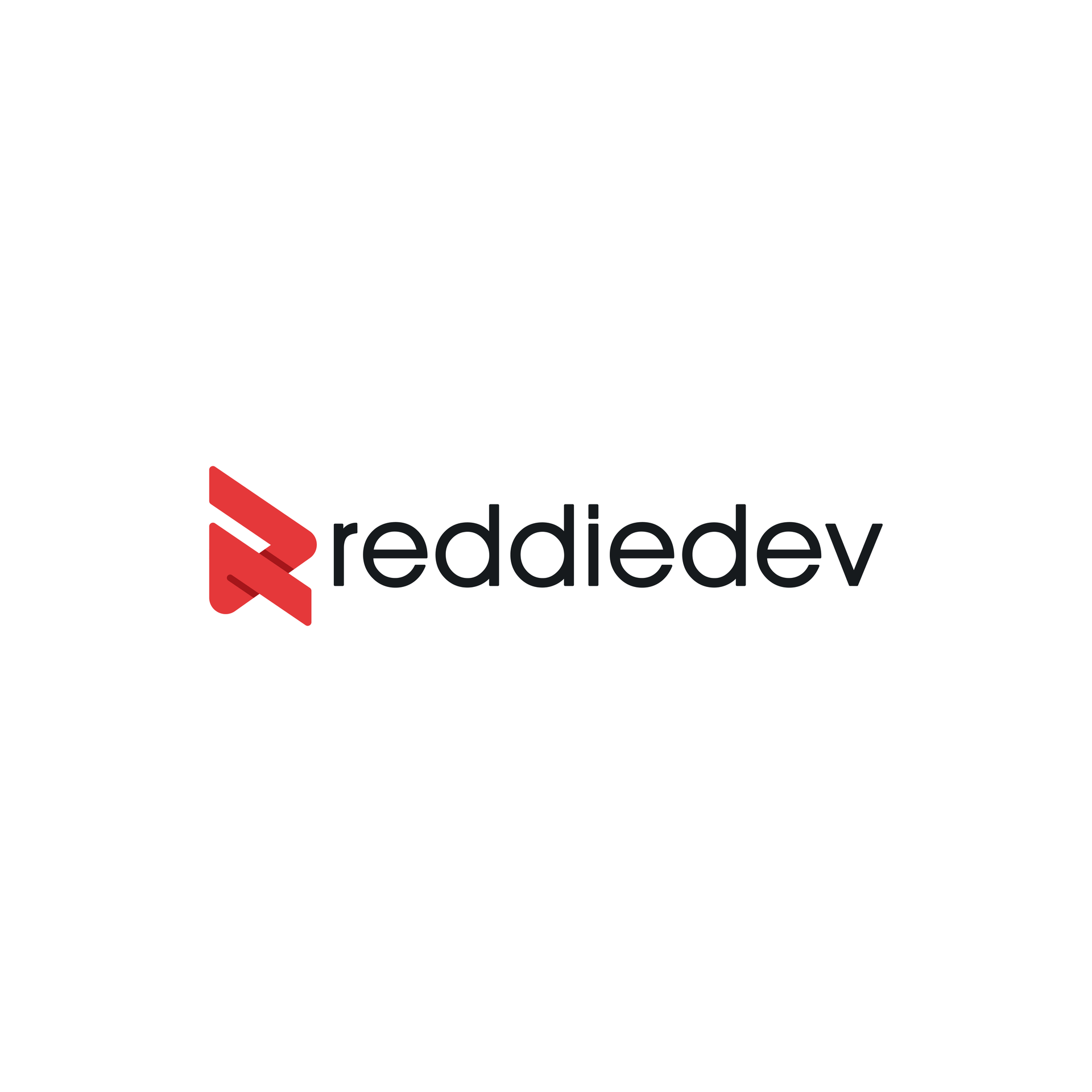
I knew I wasn’t skilled enough to design and layout the logo myself so I looked for a designer who can help me in realizing my vision. I turned to Fiverr since I was familiar with the website I am a seller there. This was important to me as well because having a commercial license to use the logo would be great. It was hard looking for a reputable modern and minimalistic logo seller since there were so many, but I eventually picked one and got to work with them. I gave them my instructions and designs I wanted the logo to be inspired from, and they exceeded my expectations with the delivery.

My requirements for the logo was that it must be flat and able to scale well, because I was going to use it in the website a lot and in other logos and favicons. The way it looks like a play button while incorporating the R in the graphic was awesome. The lines and shadows were also nice to look at. Overall, when I first saw the logo, I knew that it was the one I would take. There were other variations of the logo, but this is the one I ultimately decided upon.
Creating an avatar
Although the logo was top-notch, I still wanted a separate avatar for my accounts to separate my personal account and identity from my brand’s logo. With this, I wanted a simple minimalist (this is a prevalent theme) cartoon-like avatar. There was the option of choosing my real life images, but on the interest of my privacy and security I decided against it. For this, I once again turned to Fiverr for my digital art need. Fortunately, this time I was able to find a seller from the Philippines as well with good reviews. Their art style is to my liking so I commissioned them to make an avatar in my likeness
I think it captures me well but adding an artistic flair to it. They captured my eyeglasses and hair well. One thing I added is embed my logo on the avatar’s shirt so it looks like I am wearing merch outfit for my brand. Overall, I was very satisfied with it and I’m now using it in all of my accounts.
Deciding on a color palette
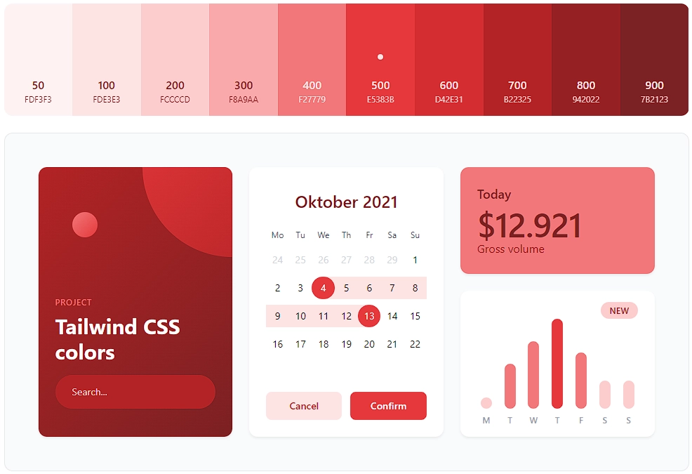
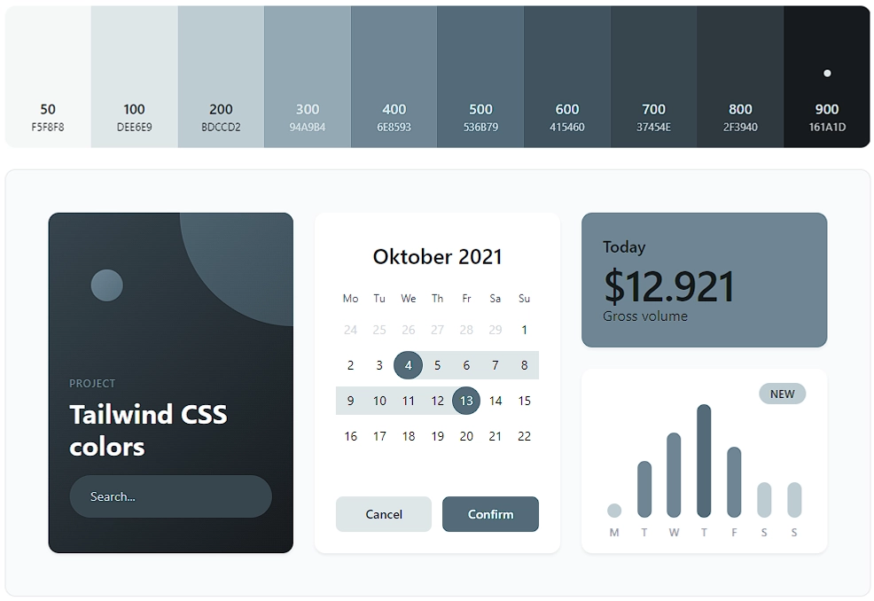
Out of a sense of personal responsibility, I have decided that the main theme of my brand and website would be red. I took inspiration from Supabase, Vercel, and Railway. I like their themes and have grown to like dark mode by default - so I made my brand in the same way! With my main color as black and main accent colors of red, white, and gray, I used a tool to generate the color palette and corresponding shades with UI Colors
Choosing my fonts
Typography is not really my strong suit as I didn’t have the eye for choosing the correct fonts to use and which would be perfect for a web application. For now, I’m looking through Font Flipper and browsing through Google Fonts.
For now, my default monospace font is Fira Code, my serif font is Roboto while my sans serif font is Open Sans.
